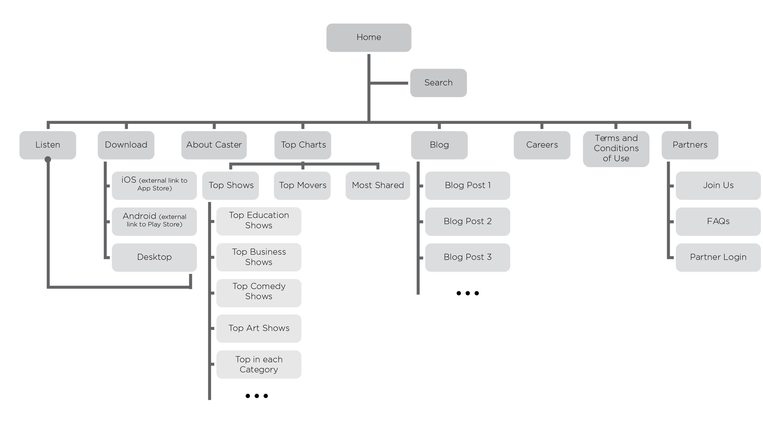
Caster | Web Design Process
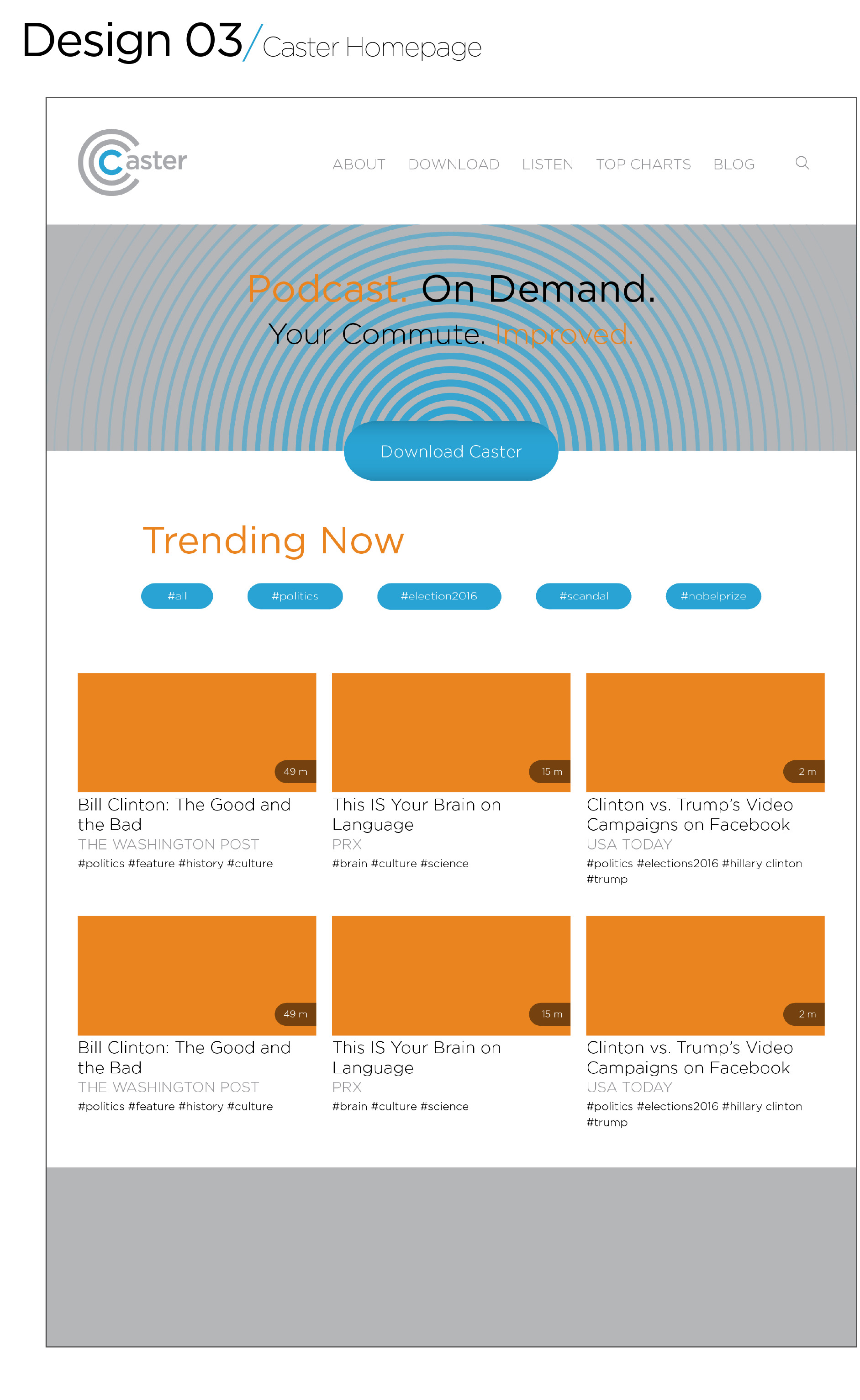
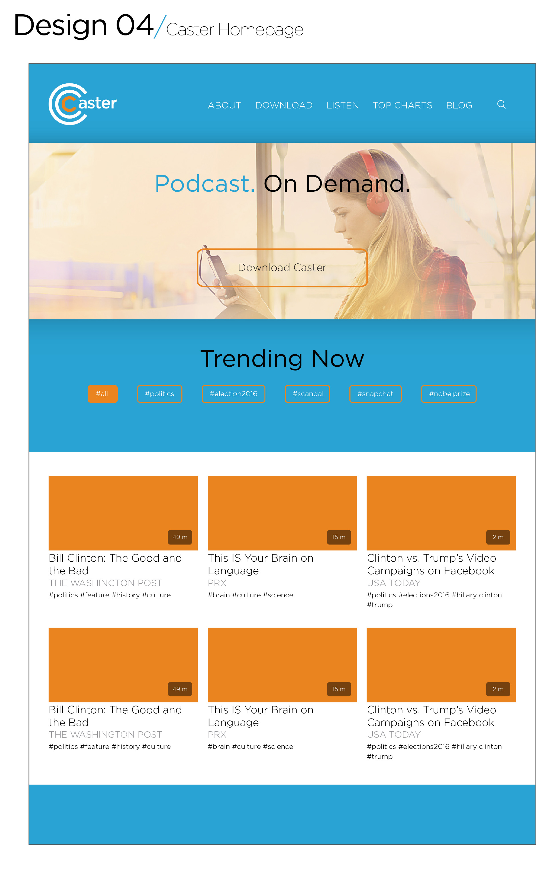
Another failed attempt at web design (followed by a swift recovery)! Since I used a horrible neon-green on the app design, I decided to change the colors to something more refined and to darken the palette a bit. I ended up with four very corporate-looking designs (more like an AT&T knockoff brand).
I changed the blue and chose my favorite go-to color that works with everything: turquoise. In this case, it was a very shallow Caribbean beach light teal. I left the orange as a complement and added a popping magenta to work with it in a gradient. It is very bold (and not my style at all), but it works!
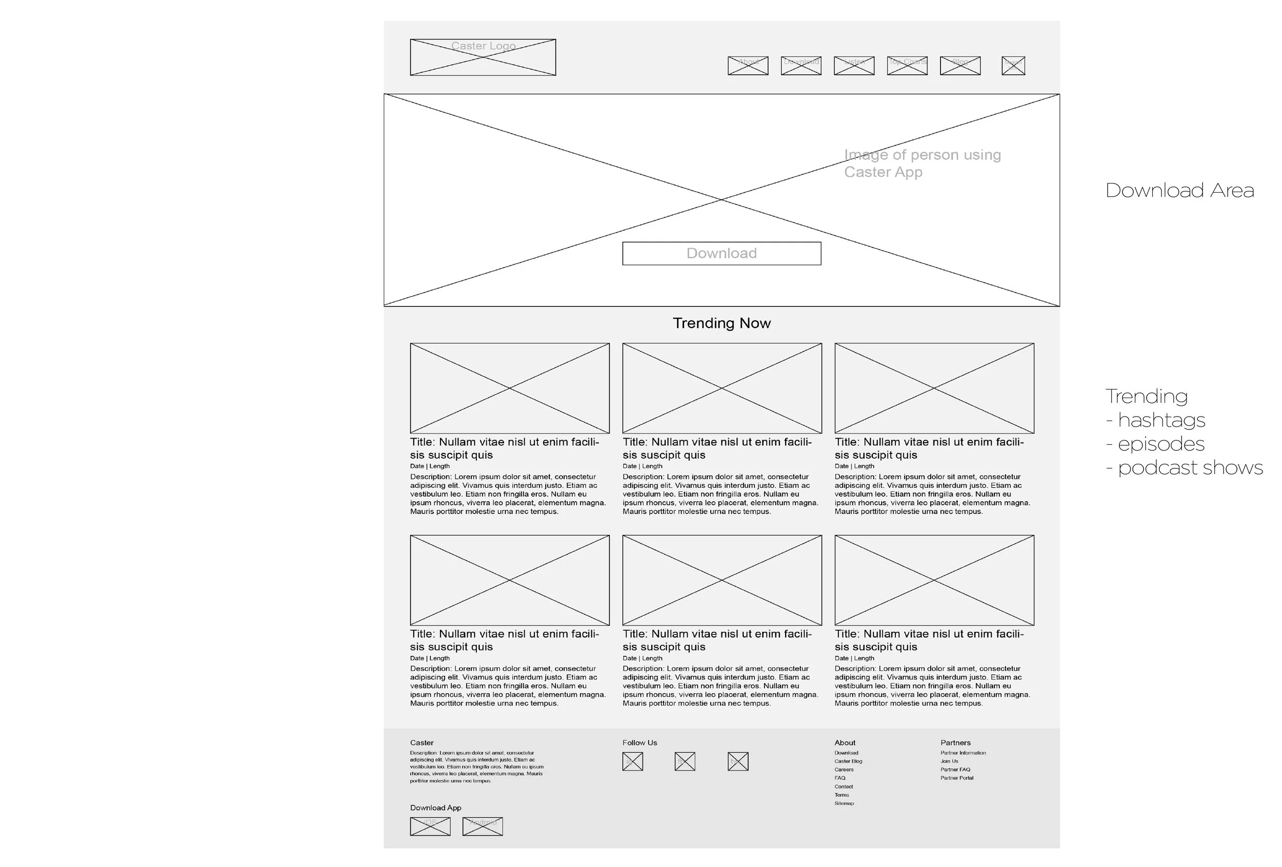
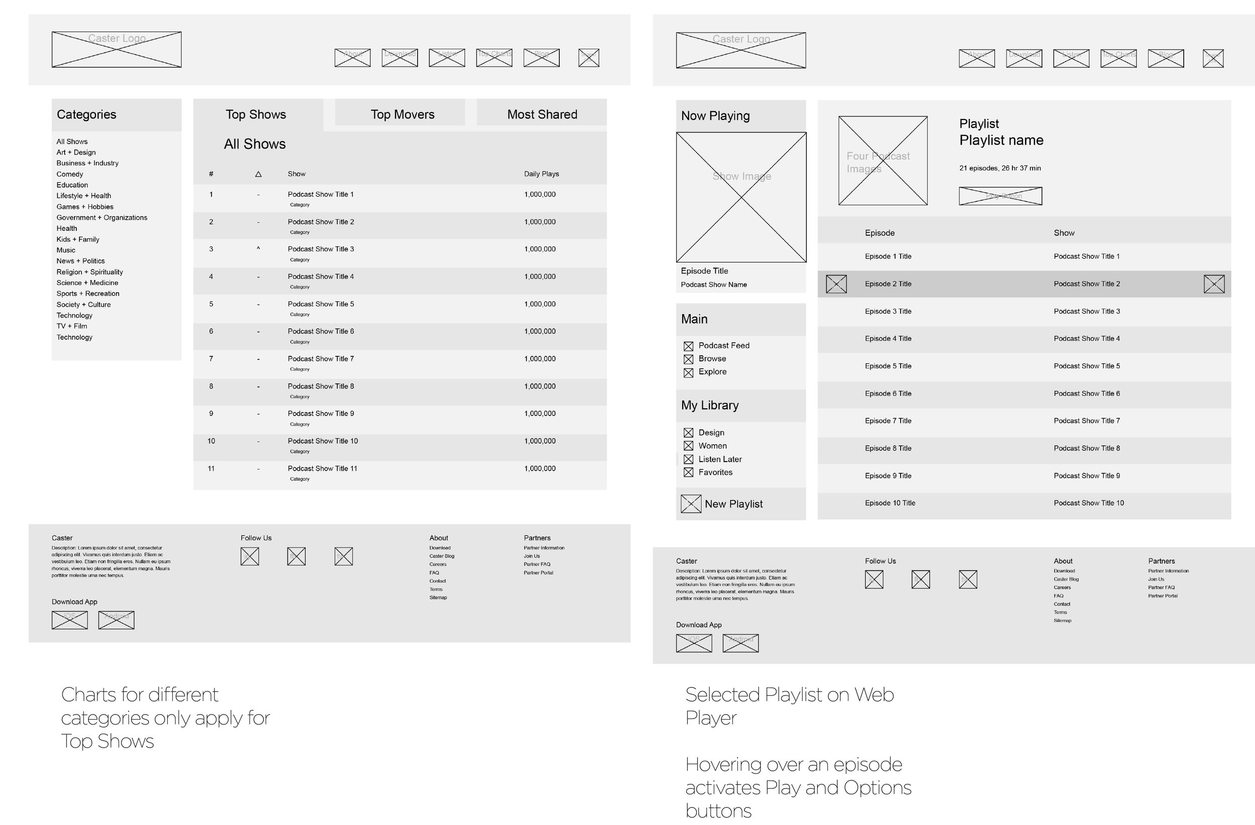


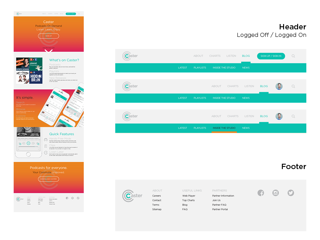
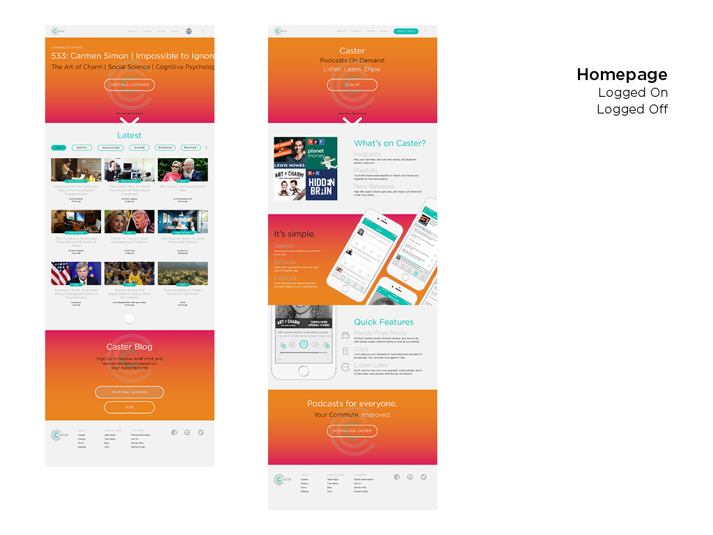
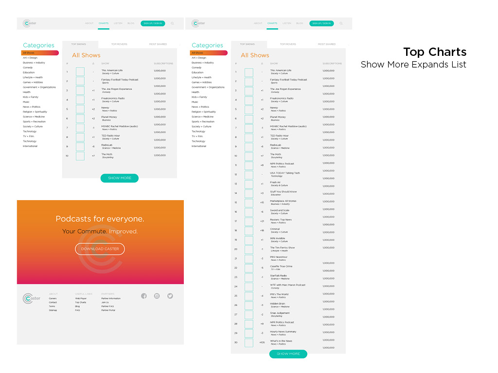
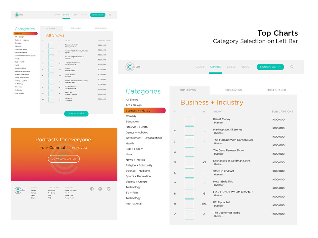
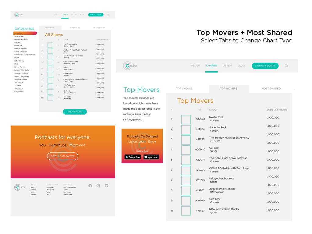
Final Design
With a lot of determination I put the website together rather quickly after making the changes in the color palette. This was designed in parallel to the blog design, which is part of the same website and included in the InVision prototype.